In POD printing, blurry DTG prints are one of the most common issues that make products look unprofessional, reduce 5-star review rates, and increase unnecessary refund costs. In most cases, the problem doesn’t come from the printer it comes from design files that haven’t been properly optimized: low resolution, overly thin strokes, weak color contrast, inaccurate gradients, or incorrect file formats.
Understanding these common design mistakes and knowing how to fix them from the start will help POD sellers ensure sharp, consistent, and high-quality prints when fulfilling orders in the U.S.
Low DPI & the Trap of “Upscaling”
This is the number one cause of pixelated, blurry DTG prints especially common among new sellers or those using images downloaded from the Internet.
DTG printers require a standard resolution of 300 DPI (Dots Per Inch) at the actual print size. Many sellers download an image from Google or Pinterest, which is typically only 72 DPI (web display standard) and very small (e.g., 500×500 pixels). They then bring it into Photoshop or Canva and stretch (resize) it to fit an A3 print area (12×16 inches).
Why Does the Print Come Out Blurry?
When you enlarge a low-resolution image, your computer performs interpolation, it fills in the gaps by adding “fake” pixels between the real ones.
- On screen: You might not notice the issue unless you zoom in closely.
- When printed: The printer reproduces those stretched, artificial pixels. This results in jagged edges, blurry outlines, and an overall hazy print that lacks crispness.
Fixes & Best Practices
- Always Start with the Correct Canvas Settings: When creating a new design file (Photoshop/Illustrator), set:
- Width/Height: Actual print size (e.g., 12×16 inches)
- Resolution: 300 DPI (Pixels/Inch)
- Color Mode: CMYK
- Never Over-Upscale: If you must use an existing image asset, upscale no more than 10–15%. If the image is too small, discard it and find a proper source.
- Use AI Upscaling Tools: If you have a great concept but the original image is too small, use AI tools such as Gigapixel AI, BigJPG, or Photoshop’s Neural Filters to enhance the resolution. AI reconstruction retains far more detail than traditional resizing.
- Check at 100% Zoom: Before exporting your file, open the artwork on your computer and zoom in at 100%. What you see at this zoom level is exactly the level of sharpness that will appear on the printed shirt.
Semi-Transparency Effects
This is the most complex and commonly encountered technical issue in designs that include smoke, fire, fog, drop shadows, or glow/light effects.
How DTG Printing Works on Dark Garments
To print colored ink on a black (or dark-colored) shirt, a DTG printer must first apply a layer of white underbase beneath the artwork. This underbase acts as a foundation that allows the colored inks on top to appear accurately and vibrantly.
Why Do Print Errors Occur?
The issue appears when your design contains semi-transparent pixels those with opacity levels between 1% and 99% (not fully opaque at 100% and not fully transparent at 0%).
- The printer’s RIP software often struggles to calculate the correct amount of white underbase for these areas.
- Case 1: Too Much Underbase: The printer sprays an excessive amount of white ink beneath the shadowed area. Result: Instead of a smooth, fading dark shadow, it turns into a muddy gray or patchy white area.
- Case 2: Not Enough Underbase: The printer does not apply enough white ink. Result: The colored ink prints directly onto the black shirt and disappears, becoming nearly invisible.
Overall Effect: Smoke, fire, and glow effects end up looking artificial, cloudy, and flat, losing the depth and natural softness they are supposed to have.
Fixes & Optimization Techniques
- Avoid Low Opacity on Dark Backgrounds: Whenever possible, keep elements fully opaque (100%) rather than using low-opacity shading.
- Use the Halftone Technique (Professional Method): This is a technique widely used by pro sellers. Instead of reducing opacity to create a fading effect, convert the area into tiny halftone dots.
- The fewer the dots, the lighter the color appears.
- Because each dot is fully opaque (100% opacity), the printer renders them sharply without complex underbase issues.
- When viewed from a distance, the human eye naturally blends the dots, creating a smooth gradient effect.
- Manually Blend into Black Backgrounds: If you want a fade-into-black effect, ensure the gradient transitions from the object’s color into pure black (#000000) not into transparency. This prevents the RIP software from misinterpreting semi-transparent pixels and ensures a clean, smooth fade.
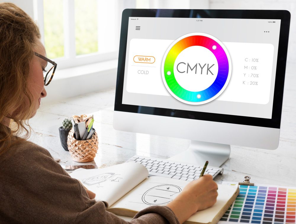
Color Errors: RGB vs. CMYK and the Neon Color Trap
You design a T-shirt with a blazing lime-green headline or a vibrant hot-pink graphic. On your MacBook Retina display, it looks bold and electric. But when the shirt arrives from the print facility, the colors look dull, dark, and lifeless. Why does this happen?
The Core Difference: Light-Based Colors vs. Ink-Based Colors
Screens (RGB): Create color through emitted light. They have an extremely wide color gamut and can display intense neon colors with ease.
Printers (CMYK): Create color by mixing inks (Cyan, Magenta, Yellow, Black). The color gamut of ink is much narrower than that of light, making it impossible to reproduce many neon or highly saturated RGB colors.
Why Do Printed Colors Look “Dull” or “Washed Out”?
Neon or ultra-vibrant colors fall outside the printer’s reproducible color range (Out of Gamut). When the printer encounters these colors, its software automatically converts them to the closest printable alternative which is usually darker, duller, and less saturated.
The large gap between what you see on screen (RGB light) and what the printer can produce on fabric (CMYK ink) makes sellers feel like the print is “off-color” or “faded.”
Fixes & Optimization Techniques
- Design in CMYK From the Start: Work directly in a CMYK color environment. What you see during design will be much closer to the actual print result.
- Use Soft Proofing: If you’re using Photoshop, enable: View → Proof Setup → Working CMYK. This simulates how your colors will look when printed. If the colors appear duller, adjust them immediately.
- Increase Saturation: Because cotton fabric absorbs light (unlike glossy photo paper, which reflects it), printed designs naturally appear more muted.
Pro Tip: Before exporting your file, increase
- Saturation: +10–15%
- Contrast: +10%
Making your design look “slightly too vibrant” on screen helps ensure the printed result looks just right bright, vivid, and eye-catching on fabric.
The “Ghost Outline” Error (Stray Pixels & Dirty Edges)
This issue commonly occurs when sellers use automatic background-removal tools or perform sloppy cutouts and masking.
The Phenomenon
A thin white outline appears around the main artwork, or tiny white dots scatter around the edges. This is usually invisible on white shirts, but on black or navy garments it becomes extremely noticeable, making the print look dirty, dusty, or poorly made.
The Cause
When the background is not removed cleanly, faint leftover pixels (with opacity around 1–5%) remain around the subject. These are very hard to see on Photoshop’s checkerboard background. However, DTG printers are extremely sensitive, they detect these pixels and print white underbase beneath them, causing visible white specks or a ghost-like halo around the design.
Fixes & Optimization Techniques
- Use a Check Layer (Background Test Layer): Before saving your transparent PNG, create a new layer at the bottom and fill it with a highly saturated color (such as bright red, neon green, or pure black). This makes any faint white or gray “ghost edges” immediately visible.
- Clean Up Thoroughly: Use the Eraser tool to remove all unwanted stray pixels around the artwork.
- Use Defringe: In Photoshop, apply: Layer → Matting → Defringe. This automatically removes leftover edge pixels and smooths the border of your design.
Printing Black Backgrounds on Black Shirts
A common beginner mistake that makes the shirt look cheap and causes the print to lose its natural sharpness.
The Issue
You have a design with white text inside a solid black rectangle. You print the entire black rectangle onto a black T-shirt. The result: a dark gray, glossy patch appears on the chest noticeably different from the matte black of the cotton fabric. When touched, it feels thick and suffocating.
The Cause
The printer’s black ink and the shirt’s dyed black fabric will never match perfectly. Additionally, when printing black ink, the DTG machine sometimes applies a thin white underbase beneath it, causing the printed area to appear charcoal gray, not true black. This creates an unnatural block that looks pasted onto the shirt.
Fix: Use the “Knock-Out Black” Technique
Apply the Knock-out Black method (removing black areas in the artwork).
- If you are printing on a black shirt, completely remove all black regions in your design and make them transparent.
- Let the shirt’s natural fabric color serve as the background for the design.
Benefits: The print blends seamlessly into the garment, avoids mismatched black tones, saves ink, and most importantly creates a thinner, more breathable, and significantly sharper final print.
Thin Line Error
DTG can print fine details, but that doesn’t mean it can print “invisible” lines.
The Issue
Line strokes thinner than 1 pixel (at 300 DPI) are at risk of disappearing or breaking. After pre-treatment, the fabric surface may become slightly textured, which can hide or distort extremely thin lines.
How to Fix It
- Ensure that important details and small text have a minimum thickness of 2 pixels (or 0.5–0.75 pt).
- If your design uses a vintage or grunge texture, make sure the distressed areas aren’t overly fragmented otherwise the print may look like a misprint with missing ink.
Anti-Blur Checklist for POD Sellers: 3 Quality Checks Before Running Ads
To maximize customer satisfaction and minimize refunds caused by print defects, strict quality control of your design files is essential. Before uploading your file to the order system, take three minutes to review the checklist below to ensure every finished product prints sharp and flawless.
Print File Checklist (Input)
This is the most important step. If the input file is flawed, even the best printing technology cannot save the final result.
- Standard 300 DPI Resolution: Check at the actual print size. Never use a 72 DPI file and “upscale” it, this will cause immediate pixelation.
- PNG/TIFF Format: Prefer 24-bit PNG with a transparent background to maintain clean edges. Use TIFF for very large files that require full color preservation.
- Avoid JPGs Downloaded from the Internet: JPGs are compressed, lose detail, and usually have a white background, unsuitable for printing on colored garments.
- Stroke ≥ 1.5 px: Thin lines and small text must be at least 1.5 pixels thick to ensure the ink adheres properly to the fabric fibers.
- Strong Contrast: Increase contrast by 10–15% to make the printed artwork stand out and prevent it from “sinking” into cotton fabric.
- Smooth Gradients: Ensure gradient areas are not harsh (no banding). Adding a slight amount of noise helps gradients print more naturally.
Product & Technical Checklist
Understanding the printing material helps you optimize your design effectively.
- Prioritize Ring-Spun Cotton: Choose garments with a smooth, low-lint surface (such as Bella+Canvas 3001) to achieve maximum print sharpness.
- Optimize Underbase for Dark Shirts: When printing on black/navy garments, ensure your design does not contain faint semi-transparent pixels, which can cause the white underbase to show through or appear cloudy.
- Appropriate Print Area Size: Adjust the artwork size according to the shirt size (e.g., a 2XL shirt needs a larger print than an S) to avoid the design looking too small or “lost” on the garment.
Mockup & Visual Inspection Checklist
The final step is a manual visual check on your screen.
- 300% Zoom Test: Open the design file and zoom in to 300%. If you see jagged edges or blurriness at this level, the print will definitely look bad.
- Grayscale Check: Temporarily convert the file to black and white. If elements blend together or become hard to distinguish, increase color contrast immediately.
- Compare Design Colors With Shirt Color: Place your design on a simulated shirt background. Make sure the text or artwork does not blend into the shirt color (e.g., dark gray text on a black shirt).
Even though DTG printing offers highly accurate color reproduction and exceptional detail, the final quality still depends heavily on how well the seller prepares the design file. By understanding common issues such as low resolution, overly thin strokes, poor contrast, or incorrect file formats, you can proactively eliminate the risk of blurry prints and ensure your products meet the highest standards before reaching U.S. customers. What matters is not only choosing the right printing technology, but also optimizing your design workflow so every order reflects the professionalism of your brand.
FlashShip is ready to support POD sellers at every step from design file optimization and selecting the right DTG-friendly blank products, to running fast and reliable U.S. fulfillment operations to ensure your orders achieve top quality while keeping costs efficient.
Contact us anytime via seller.flashship.net or the hotline (+84) 852 763 445 to receive detailed consultation and start fulfilling your POD products today!