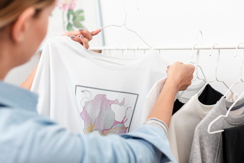
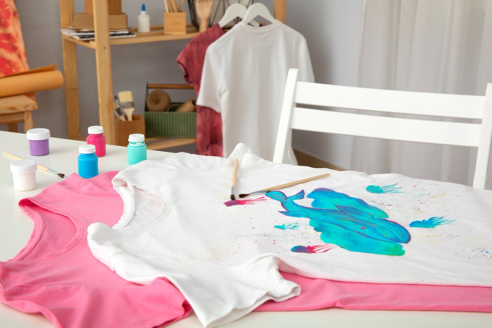
A successful sales season doesn’t just depend on a great design it also comes from the perfect color combination between the T-shirt and the print. A well-balanced print with harmonious and vibrant colors can make your product stand out on e-commerce platforms and leave a strong impression on customers.
On the other hand, poor color pairing can make even the most beautiful design look dull or lose its visual appeal. This article will help POD sellers master the fundamental principles of color matching, learn how to combine colors effectively, and avoid common mistakes to ensure every product looks striking, professional, and irresistible to buyers.
Basic Principles of Color Matching
Before starting any design, sellers need to understand the fundamental principles of color. A successful POD product isn’t just about composition it’s also about how colors are combined and balanced.
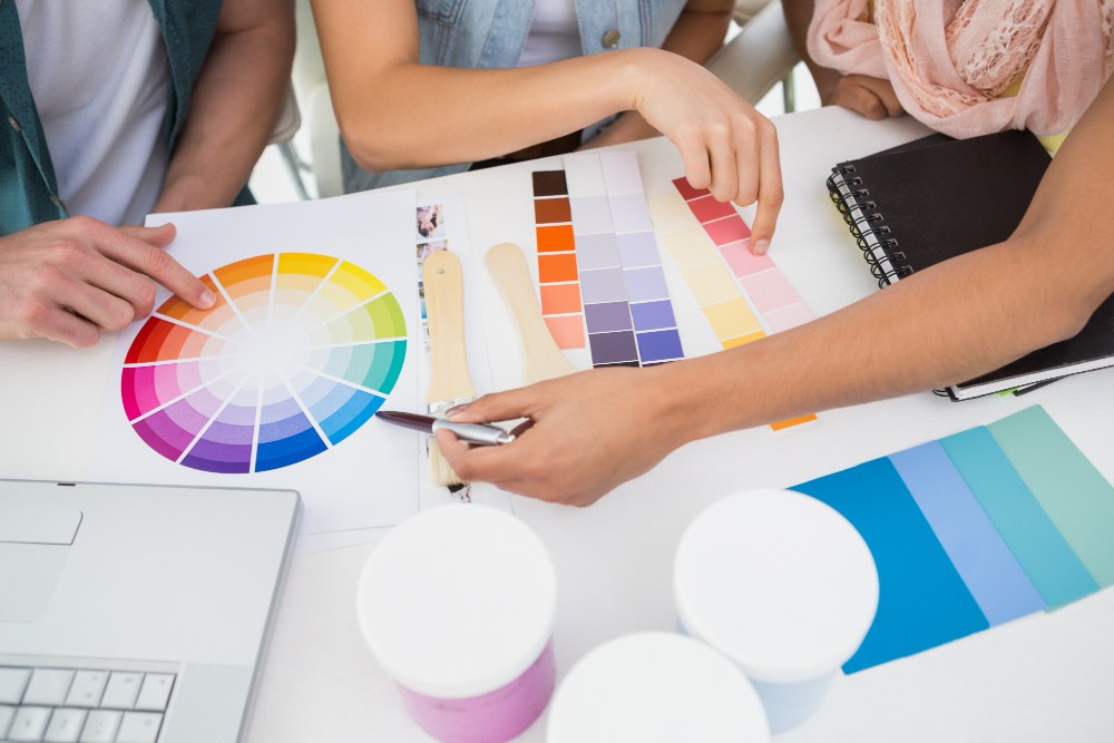
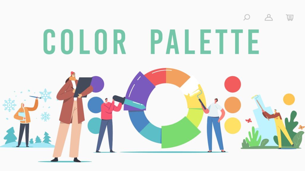
The Color Wheel and the Relationship Between Colors
The Color Wheel is one of the most fundamental and powerful tools in graphic design. It’s not just an abstract diagram but a visual map that illustrates the relationships between color hues, helping designers identify harmonious color combinations and contrasting tones to create visual impact.
The color wheel is composed of:
- Primary Colors: Red, Yellow, and Blue the three base colors that cannot be created by mixing other colors.
- Secondary Colors: Orange, Green, and Purple formed by mixing two primary colors (e.g., Yellow + Blue = Green).
- Tertiary Colors: Created by mixing a primary color with a neighboring secondary color (e.g., Red + Orange = Red-Orange).
Understanding how colors interact on the color wheel is the key foundation that enables you to confidently choose the right ink and garment colors for each product campaign.
Common Color Matching Rules
Based on the color wheel, designers have developed timeless color combination principles that ensure both visual appeal and strong aesthetic balance.
- Complementary Colors: This method pairs two colors that sit opposite each other on the color wheel (e.g., Blue–Orange, Yellow–Purple). It creates strong contrast and visual energy, making your design vibrant and eye-catching. This approach works especially well for youth-oriented products or energetic niches such as sports and music.
- Analogous Colors: This scheme uses two to three colors that sit next to each other on the color wheel (e.g., Yellow, Yellow-Orange, Orange). It produces a harmonious, soothing, and natural look — ideal for designs inspired by nature, relaxation themes, or brands that aim to convey warmth and friendliness.
- Triadic Colors: This rule uses three colors evenly spaced around the color wheel, forming an equilateral triangle. It provides color diversity and balance while maintaining harmony. The result is a lively, cheerful, and dynamic look that attracts attention without overwhelming the viewer.
- Monochromatic Colors: This technique applies different shades, tints, and tones of the same color. It’s a safe, elegant, and modern choice often used in minimalist or premium designs. Monochromatic palettes highlight design details without creating visual clutter.
The Psychological Impact of Colors in POD Design
Colors hold invisible power they directly influence emotions and buying behavior. Understanding their meanings allows sellers to create products that are not only visually appealing but also communicate the right message.
- Red: Evokes energy, passion, and a sense of urgency. Perfect for Valentine’s Day designs, sports themes, or discount campaigns.
- Blue: Represents trust, calmness, and professionalism. Ideal for business, technology, or ocean-inspired niches.
- Yellow: Conveys happiness, optimism, and warmth. Commonly used in products for children or designs that promote positivity.
- Green: Symbolizes nature, health, growth, and freshness. A top choice for eco-friendly, yoga, or healthy lifestyle niches.
- Black: Reflects strength, luxury, and sophistication. Black shirts are always a popular base as they make bright ink colors stand out beautifully.
- White: Minimalist, pure, and easy to pair. White shirts serve as a perfect canvas to highlight complex or multi-colored designs.
Popular T-Shirt and Ink Color Combinations
Once you understand the basic principles, pairing T-shirt and ink colors becomes much easier. Below are some of the most common and effective combinations that POD sellers should know to create products that are both eye-catching and aesthetically pleasing.
Light-Colored Shirts – Dark Ink: The Golden Formula for Clarity
This is one of the safest and most effective rules in T-shirt printing, especially in the POD industry. A light-colored base (white, beige, ash gray, or pastel) acts as a perfect canvas, allowing dark ink designs to appear crisp, legible, and detailed. This formula ensures that your message or artwork is communicated as clearly as possible.
Timeless combinations include:
- White / Ash Gray shirts: Perfectly match with black, navy, burgundy, or bottle green ink.
- Light Beige / Sand shirts: Look exceptionally elegant when paired with dark brown, olive green, or black ink.
- Pastel shirts (pink, mint, light yellow): Create a soft yet effective contrast with black or charcoal gray ink.
This color pairing is particularly ideal for typography designs, logos, or intricate line-art graphics, giving your products a professional look that appeals to a wide range of customer tastes.
Dark-Colored Shirts – Light Ink: A Bold Statement of Contrast
If you want your design to stand out and capture attention instantly, reverse the previous formula. When using dark-colored shirts such as black, navy, or charcoal, light-colored inks will “pop” dramatically, creating a striking visual effect. This is a fantastic choice for graphic, retro, or bold brand designs that aim to express personality and confidence.
Highly effective combinations include:
- Black shirts: The perfect base for white, bright yellow, neon green, or vibrant pastel inks.
- Navy shirts: Pair beautifully with off-white, gold, or coral ink.
- Burgundy / Olive shirts: Look unique and sophisticated when printed with cream or light beige ink.
This color scheme delivers maximum contrast especially effective with modern printing technologies like DTG or DTF, where a white underbase helps bright inks appear vivid and long-lasting.
Tone-on-Tone: A Minimalist Trend of Subtle Sophistication
Tone-on-tone (same hue, different shade) is a color-pairing technique highly favored by premium and minimalist fashion brands. Instead of creating contrast, it achieves harmony and refinement by using variations of the same color family. The result is a stylish, elegant, and tastefully understated look.
Examples:
- Light Beige shirt: Printed with deep coffee-brown ink.
- Olive shirt: Paired with a darker moss-green print.
- Navy shirt: Features a logo or text in sky blue (baby blue).
This color pairing is ideal for minimalist, lifestyle, or vintage niches, as well as brands that want to project a refined, modern, and effortlessly classy image.
Complementary Color Pairing: Bold and Full of Energy
For sellers who love to experiment and want their products to truly stand out, complementary colors (opposite pairs on the color wheel) are your secret weapon. This combination creates a “visual explosion” dynamic, vibrant, and impossible to ignore.
Striking examples:
- Mustard Yellow shirt: Printed with deep purple ink.
- Burnt Orange shirt: Looks stunning with navy blue designs.
- Green shirt: Made edgy and modern with fuchsia pink details.
A key tip is to balance proportions to avoid overwhelming the viewer. Let the shirt color serve as the dominant background and use the contrasting ink color as an accent to draw smart, intentional attention.
Following Seasonal Trends and Special Occasions
A smart strategy for POD sellers is to align color choices with seasonal trends or major holidays. This helps your products feel timely, relevant, and emotionally connected to buyers’ purchasing moods.
- Spring: Opt for light and refreshing hues like mint green, peach pink, and lavender purple.
- Summer: Embrace bright, tropical tones such as coral orange, teal, and lemon yellow.
- Autumn: Choose warm, cozy colors like earthy brown, terracotta, mustard yellow, and olive green.
- Holiday Seasons: Stick with signature palettes red, green, and white for Christmas; orange, black, and purple for Halloween; or red and pink for Valentine’s Day.
These choices not only keep your catalog trendy but also make it easier for customers to find products that perfectly fit seasonal and festive occasions.
Common Mistakes When Matching Shirt and Ink Colors
Even experienced sellers can make mistakes when it comes to color selection, especially in large-scale printing. Below are the most common errors and how to fix them.
Lack of Contrast
This is one of the most common yet fundamental mistakes. When the ink color and the shirt color are too similar in tone, the design becomes dull, hard to read, and almost invisible- especially when customers only glance at your product for a few seconds.
- Bad examples: Light gray ink on a heather gray shirt, navy ink on a black shirt, or cream ink on a white shirt.
- Pro fix: Before sending your file to print, always check the design in grayscale mode. If you can still clearly distinguish details and text, the contrast level is good. Also, remember the golden rule: dark ink on light fabric, and light ink on dark fabric.
Incorrect Color Mode (RGB vs. CMYK)
This is a critical technical error often overlooked by beginners. Computer and phone screens display colors in RGB mode (Red, Green, Blue), an additive color system based on light. However, most industrial printers use CMYK (Cyan, Magenta, Yellow, Black) – a subtractive color system based on ink.
- The result: That bright neon blue on your screen may turn into a dull, lifeless green once printed.
- How to fix: Always set your workspace color mode to CMYK in your design software (Photoshop, Illustrator, etc.) from the very beginning. Before mass production, request a print sample from your supplier to ensure the final colors match your expectations.
Printing Light Ink on Dark Fabric Without a White Underbase
On dark-colored shirts, fabric fibers tend to absorb ink-especially light colors. Without proper preparation, the print colors can appear dull, faded, and far less vibrant than the original design.
- How to fix: Always ensure that your printing process includes a white underbase beneath the design. This layer acts like a primer on a wall, preventing the fabric color from affecting the printed ink. It helps the final colors appear vivid, accurate, and true to the design. Be sure to discuss this detail carefully with your print provider before production.
Inconsistent Colors Across Product Lines
When offering the same design across multiple product types (T-shirts, hoodies, sweatshirts), it’s common to notice slight differences in base fabric colors, even when labeled as the same shade. This happens because different products may be made from different materials (e.g., 100% cotton vs. 50/50 cotton-poly blend) or sourced from different manufacturers.
- How to fix: To maintain color consistency, try to source all blanks for a given design from the same manufacturer (for example, use only Gildan or only Bella+Canvas for a specific design). Additionally, refer to the official physical color swatches from the manufacturer instead of relying solely on digital images for the most accurate color assessment.
Following Color Trends That Don’t Match Your Niche
Jumping on color trends (like neon, tie-dye, or metallic tones) can be a smart move but it can also backfire if the trend doesn’t align with your target audience.
- Example: A T-shirt store targeting office workers who prefer minimalist styles will struggle to sell a neon green collection, even if it’s the “color of the year.”
- How to fix: Always ask yourself, “Would my customers actually wear this color?” Define a core color palette that truly reflects your brand’s style and niche. You can test trendy colors on a few limited-edition products first before making a larger investment.
Color Matching Tips for POD
To achieve the best results in color coordination, sellers need to balance theory with practical application. Below are some actionable tips to help you optimize your designs and boost sales performance.
Use Smart Mockups to “Test Before You Sell”
A flat design file on your software screen can never fully represent how the final product will look in real life. That’s where mockups come in they act as the bridge between concept and reality.
- Why it matters: Mockups help you visualize how colors appear under different lighting conditions, how the print interacts with fabric folds, and how the design looks on an actual model. This is a crucial step to catch issues with contrast, placement, or proportions before launching your product to the market.
- Effective tools: Platforms like Placeit offer an extensive library of lifestyle mockups, while built-in tools such as Canva Smart Mockup or FlashShip Mockup Tool let you preview designs quickly and conveniently within your workflow.
- Pro tip: Don’t stop at just one mockup. Create at least 3–5 versions using your best-selling shirt colors (e.g., black, white, sport gray) and one trendy color. This not only helps you find the most optimal combination but also gives customers more attractive options to choose from in your product listings.
Build a Brand Color Palette to Strengthen Recognition
As your store grows, selling random, unconnected designs becomes less effective than building a cohesive and recognizable brand identity and your color palette is the heart of that identity.
- Long-term benefits: A consistent color palette helps customers instantly recognize your products among thousands of competitors. It conveys professionalism, trust, and makes your future design process much simpler and more efficient.
- How to build it: Start by clearly defining your niche. For example, a pet niche brand can use cheerful pastel tones, while a veteran-focused brand would be better suited to strong, earthy hues like olive green, charcoal gray, black, and white.
- Pro tip: Create a simple brand style guide that defines 3–5 core colors and how they should be used. This becomes a valuable asset when scaling your business or outsourcing design work, ensuring your brand stays consistent and recognizable.
Stay Ahead of Market Color Trends
Fashion is always evolving and color is the most dynamic element of that change. Keeping up with color trends ensures your products remain fresh, relevant, and aligned with modern customer preferences.
Reliable references: Major organizations like Pantone and Adobe regularly release their “Color of the Year” and annual trend reports. By following these, sellers can anticipate next year’s aesthetics and plan their designs ahead of key shopping seasons.
Suggested color trends for 2025–2026:
- Digital Blue: A vibrant shade of blue symbolizing technology, artificial intelligence, and creative innovation in the digital era.
- Terra Clay: A warm terracotta tone that evokes a sense of sustainability, authenticity, and connection to nature.
- Cyber Lime: A bold neon lime color that reflects optimism and the energetic spirit of the younger generation.
Pro tip: You don’t have to make trendy colors your main shirt base. Instead, try using them as accent ink colors on neutral shirts (black, white, gray) to create designs that are both safe and fashion-forward.
Respect Cultural and Market Differences
When selling on international platforms like Etsy or Amazon, color is no longer just a matter of aesthetics, it becomes a cultural language.
- Meanings can vary greatly: In the United States, the combination of red, white, and blue symbolizes patriotism. In many Asian countries, red represents luck and prosperity, while white is often associated with mourning or funerals.
- Pro tip: Before launching an ad campaign targeting a specific country, take a few minutes to research “the meaning of [color name] in [country name].” This small step can help you avoid cultural missteps and create products that resonate emotionally with local buyers.
Understand Printing Technologies and Fabric Materials
A perfect design can be ruined if produced using the wrong printing method or fabric type. Each printing technology has its own strengths and limitations:
- DTG (Direct-to-Garment): Delivers vibrant colors and high detail on 100% cotton shirts. However, printing on dark fabrics costs more due to the need for a white underbase.
- DTF (Direct-to-Film): A rising star in the industry, offering extremely vivid and durable prints that work on various materials cotton, polyester, and blends.
- Sublimation: Produces permanent, non-peeling colors that fuse directly into the fabric fibers, but is limited to light-colored polyester garments.
Pro tip: Don’t hesitate to consult your print provider. Ask the key question: “For this design and fabric type, which printing method will produce the most accurate and vibrant result?” The advice you receive from printing experts is invaluable to ensuring your final product looks exactly as you envision.
Color pairing between T-shirts and inks isn’t merely about visual appeal it’s a strategic element that helps POD sellers create distinctive, recognizable, and better-selling products. An attractive design starts with understanding color principles, choosing the right tones for your niche, and maintaining strict control over the printing process to ensure accurate, vibrant colors.
Remember, in the POD industry, every small detail can make a big difference. When your color combinations are on point, your products won’t just look great in mockups — they’ll stand out beautifully in real life when they reach your customers.
Contact us at (+84) 943 024 337 or visit seller.FlashShip.net for detailed consultation, quick quotations, and to start building your sustainable POD brand with FlashShip today.