
The placement of a logo on a T-shirt is not just a small design detail, it’s a strategic factor that determines whether your product truly stands out and stays memorable in the customer’s mind. A precisely positioned, balanced, and sharp logo reflects the professionalism of the seller while elevating the overall brand value. Conversely, even a slight misalignment or printing error can make the entire design look unbalanced and less appealing. This article will help you master the principles of proper logo placement, choose the right proportions and dimensions, and turn every T-shirt into a product that carries your brand’s unique identity.
![]()
Why is placing the logo in the right position on a T-shirt so important?
Before diving into technical specifications, it’s essential to understand why this matters so much. This isn’t just a random design rule, it’s built on proven principles of design balance and marketing psychology that directly impact how customers perceive and remember your brand.
- Building Professionalism and Trust: Imagine receiving two T-shirts. One has its logo neatly and evenly placed on the familiar left chest area, while the other has its logo positioned too low near the stomach or too high near the shoulder. Instantly, the second shirt gives off the impression of a defective or carelessly made product. The logo’s position serves as the first visual cue of your brand’s precision and quality.
- Enhancing Aesthetics and Visual Balance: The human body isn’t a flat surface, which means logo placement must be calculated so it appears natural and balanced when worn. Standard logo positions (like the left chest) have been established over decades because they are “golden spots” for the eye, visually pleasing, easy to notice, and harmonious with the overall garment.
- Strengthening Brand Recognition: A logo placed in a visible and familiar position helps customers remember your brand more easily. When your customer wears that shirt in public, it becomes a piece of free advertising. Conversely, if the logo is placed in an awkward or hidden spot, you miss out on this valuable marketing opportunity.
- Influencing the Perceived Value of the Product: A product that shows attention to even the smallest details, such as logo positioning, conveys a sense of quality and craftsmanship. Customers are often willing to pay more for a product that reflects professionalism and genuine care from the seller.
In short, proper logo placement isn’t optional, it’s a must for any serious POD seller aiming to build a sustainable and respected brand.
Common Logo Placement Positions on T-Shirts
Each logo placement creates a different visual impression and serves a distinct purpose. POD sellers need to understand the meaning, advantages, disadvantages, and practical applications of each position to choose the most suitable one for their product.
Left Chest
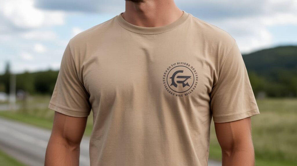
This is the most classic and safest placement in the world of T-shirt printing. When people think of a logo on a shirt, this is almost always the position that comes to mind. The logo typically measures between 8–10 cm, placed neatly at heart level and slightly shifted to the left of the shirt’s center line.
Advantages: It creates a refined, professional, and well-balanced look. The left chest position is highly recognizable yet not too flashy, perfect for brand-building (POD branding), company uniforms, or formal event apparel. It conveys trust, professionalism, and credibility both for the wearer and the brand.
Disadvantages: The limited space makes it challenging to display logos with complex designs, multiple elements, or long taglines. This placement works best for simple, clean icon or wordmark logos that can be easily recognized at a glance.
Center Chest
If you want your design to be the focal point of attention, the center chest placement is a must. This area is ideal for text-based logos, bold symbols, or statement slogans. The common print size for this position ranges from 20–28 cm in width.
Advantages: A centrally placed logo naturally draws the viewer’s attention, making it perfect for fashion-forward T-shirts, promotional items, or expressive designs that showcase personality and attitude.
Disadvantages: This position requires careful consideration of proportions. A logo that’s too large or features colors with excessive contrast against the shirt can easily disrupt balance, making the overall look heavy and less refined.
Sleeve
Printing a logo on the sleeve is an increasingly popular trend, especially for sportswear, streetwear, and team shirts. It’s a great way to add a distinctive brand element without interfering with the main design on the front or back of the shirt.
Advantages: It creates a unique and subtle highlight, showing the brand’s attention to detail and making the T-shirt more visually interesting. You can even print logos on both sleeves to create a balanced and cohesive look.
Disadvantages: The print area is quite limited, so the logo should be simple, concise, and sharp to maintain clarity and recognizability.
Back Neck (Behind the Collar)
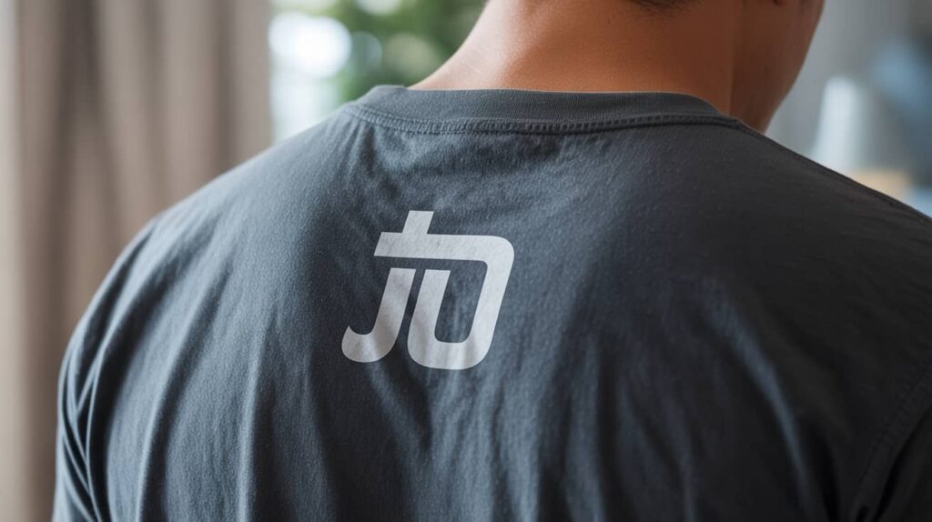
The back neck area may seem small, but it carries significant branding power. Commonly used to print a logo or brand name instead of a traditional tag, this position adds a premium and polished touch to the garment.
Advantages: It subtly enhances brand recognition, even when the wearer is seen from behind. This placement is often associated with high-quality fashion brands, helping your T-shirt convey a more elevated and professional image.
Disadvantages: The position can be easily overlooked — especially if the customer has long hair or wears an outer layer that covers the back of the neck.
Full Back (Center Back)
When you need a large area to showcase a message, image, or promotional artwork, the center back placement serves as the perfect canvas.
Advantages: It creates a powerful visual impact and leaves a lasting impression from behind. This placement is ideal for event shirts, team-building apparel, staff uniforms (where clear information is needed), or POD products designed around a specific theme or campaign.
Disadvantages: Printing on such a large area generally costs more. Additionally, aligning a big design precisely in the center back requires high printing accuracy to avoid distortion or imbalance that could affect the final product quality.
Other Creative Placements:
- Oversized Front Logo: A large design that extends beyond the central chest area, commonly seen in streetwear fashion.
- Side Print: A logo printed vertically along one side of the shirt, creating a unique and dynamic effect.
- Hem Tag: A small logo or tag placed at the bottom hem of the shirt, similar to branding details found on premium fashion labels.
Guide to Placing a Logo on a T-Shirt Using Design Software
After choosing the right placement, how can you accurately represent it in your design file? The answer lies in creating a mockup. A well-prepared mockup not only helps you visualize the final product but also serves as the reference file your POD provider will use for printing.
Professional Workflow with Adobe Photoshop:
This is the most powerful tool for creating realistic and precise mockups.
- Find or create a high-quality mockup template:
Use real T-shirt images with high resolution to ensure clarity and accuracy. - Use Rulers and Guides:
Go to View > Rulers (Ctrl/Cmd + R) to display the rulers.
Drag guides from the rulers to mark the standard logo positions mentioned in section 2 (for example, create a guide 10 cm below the neckline).
This ensures consistency across all your designs. - Use Smart Objects:
Place your logo design file inside a Smart Object.
This allows you to resize or adjust the logo without losing quality and to apply realistic effects (such as shadows or fabric textures) naturally. - Position the Logo Accurately:
Move the Smart Object layer containing your logo to align it precisely with the guides. - Save the File with Standard Settings:
Export your final design file as a PNG with a transparent background at 300 DPI to ensure print-ready quality.
Simpler Online Tools (Canva, Placeit):

For those who aren’t familiar with Photoshop, these tools offer an excellent and user-friendly alternative.
- Placeit: Provides thousands of T-shirt mockup templates featuring real models and backgrounds. Simply upload your logo, and the platform will automatically place it on the shirt. Most placements follow standard positions, but you can still adjust the size and location within the allowed range.
- Canva: You can upload a T-shirt image, then add your logo and position it where you want. Use Canva’s alignment tools to ensure the logo is perfectly centered or properly aligned to your desired layout.
How to Ensure Your Printed Logo Isn’t Blurry, Misaligned, or Pixelated
Placing your logo in the right position means nothing if the final print comes out blurry, distorted, or off-color. Below are the key technical factors every POD seller must master to guarantee professional print quality.
Resolution
-
- Rule #1: Always design and export your files at 300 DPI (Dots Per Inch) — the gold standard in printing to ensure crisp, high-quality images.
- How to calculate it: Don’t just rely on the DPI value — pay attention to the actual pixel dimensions.
- For example, if you want to print a logo 10 cm wide (approximately 4 inches) on the left chest:
- Minimum pixel width = 4 inches × 300 DPI = 1200 pixels.
-
- That means your logo file should be at least 1200 pixels wide to maintain sharpness when printed at 10 cm.
File Formats
- Raster (Bitmap): These include formats such as PNG, JPG, and GIF. They are made up of individual pixels, which means that when you enlarge a raster image, it can become blurry or pixelated.
- When to use: Ideal for complex designs, photographs, or images with many colors. Always prefer PNG with a transparent background when using raster files for logos.
- Vector: These include formats such as AI, EPS, and SVG. Vector files are created using mathematical equations and curves, allowing them to be scaled infinitely without any loss of quality.
- When to use: This is the best format for logos. Whenever possible, design and store your logo in a vector format to ensure perfect sharpness at any print size.
Color Space
- RGB (Red, Green, Blue): This color model is used for digital displays such as computer monitors and smartphones. Colors in RGB mode tend to appear brighter and more vibrant.
- CMYK (Cyan, Magenta, Yellow, Key/Black): This color model is used for printing.
- Why it matters: If you design in RGB but print using CMYK, the colors may appear duller or inaccurate in the final product. To achieve the most accurate color results, always set your design software’s color space to CMYK from the very beginning.
Printing Methods for Logos on T-Shirts
Understanding different printing technologies helps you choose the right POD provider and know the limitations of each method.
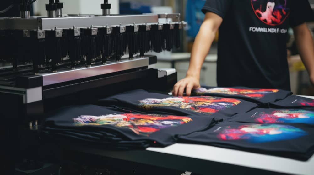
Direct to Garment (DTG) Printing
- How it works: Similar to an inkjet printer printing directly on paper, a DTG printer sprays ink directly onto the fabric fibers.
- Advantages: Can print complex, full-color designs with no color limitations. Perfect for POD models as it allows printing one item at a time. The ink absorbs into the fabric, creating a soft and natural feel.
- Disadvantages: Higher cost per piece compared to screen printing. Works best on 100% cotton fabrics for optimal color vibrancy.
Screen Printing
- How it works: Uses a mesh screen (stencil) to push ink through onto the fabric — one screen per color.
- Advantages: Very cost-effective for large runs. Produces vivid, durable colors that last through many washes.
- Disadvantages: Not suitable for POD due to high setup costs for each design. Difficult to print multi-color or gradient designs.
Direct to Film (DTF) Printing
- How it works: The design is printed onto a special PET film, then heat-pressed onto the shirt.
- Advantages: A rapidly growing modern method. Works on multiple fabric types (cotton, polyester, blends). Delivers sharp, vibrant colors with high durability. Suitable for both small and large orders.
- Disadvantages: The print surface may feel slightly more plastic-like compared to DTG.
Heat Transfer Vinyl (HTV) Printing
- How it works: Colored vinyl sheets are cut into shapes and heat-pressed onto the garment.
- Advantages: Extremely durable, with clean and solid colors. Ideal for simple designs, 1–2 color logos, names, or numbers.
- Disadvantages: Not suitable for complex or multi-color designs.
Notes When Printing Logos for Branding or POD Business Purposes
- Consistency Is Key: Build a clear brand guideline that defines the logo’s placement, size, and color across all products. Consistency creates a professional and easily recognizable brand image.
- Always Order Samples: This is non-negotiable. Never sell a product you haven’t held in your hands. Samples allow you to verify the position, size, print quality, and actual colors before launching the design.
- Consider Fabric and Shirt Color: A logo that looks great on a white shirt may “disappear” on black fabric. Prepare different logo variations (for example, a white logo for dark shirts and vice versa). Fabric types, cotton, polyester, or tri-blend, can also affect color accuracy and sharpness.
- Work With a Reliable POD Provider: A trustworthy partner provides accurate design templates, clear file requirements, and modern printing technology to ensure the final product matches your mockup perfectly.
- Don’t Overlook the Overall Design: The logo is only one part of the whole. Make sure it complements other design elements on the shirt (if any) and aligns with your brand’s overall aesthetic and identity.
Placing the logo in the right position not only makes a T-shirt more visually balanced and aesthetically pleasing but also helps reinforce the brand identity of POD sellers. A shirt with a well-positioned, sharp, and properly scaled logo creates a professional impression, making it easier for customers to remember the brand and trust the product’s quality. From the design and mockup stages to selecting the printing method, every step must be executed carefully to ensure the logo remains crisp, vibrant, and long-lasting over time.
For detailed consultation on logo printing techniques, proper placement, and choosing the right blank T-shirt for each POD product line, please contact (+84) 943 024 337 or visit seller.FlashShip.net. The FlashShip team is always ready to support you on your journey to building a professional and successful POD brand.
