In the POD industry, a strong design is key to attracting buyers, but closing the sale takes more than creativity alone. Precise design placement plays just as critical a role in winning over your customers. A T-shirt with off-center, unbalanced, or poorly placed artwork can leave a bad impression on customers, even if the concept is highly creative. That’s why mastering design alignment is an essential skill for every POD seller. This article will provide you with everything you need to know from the basics to advanced techniques about T-shirt design placement, helping you confidently turn your creative ideas into best-selling POD products.
Key Terms to Know When Aligning T-Shirt Designs
Before diving into specific design placement positions, familiarizing yourself with industry-specific terms will help you communicate more effectively with suppliers and use design tools more professionally.
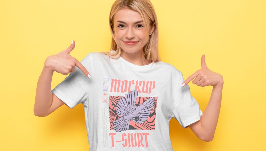
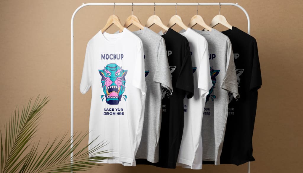
- Mockup: A visual representation of the product. It’s an image of a T-shirt (usually shown on a model or in a flat lay) with your design applied, helping customers visualize the final product.
- Print File: The final design file you send to the supplier for printing. This is typically in high-resolution PNG, JPG, or SVG format.
- Print Area: The maximum area on the shirt where your design can be printed. This varies depending on the product, shirt size, and supplier.
- Resolution: Measured in DPI (Dots Per Inch). This is a critical factor that determines the sharpness of your print. The gold standard for POD printing is 300 DPI. Designs with lower DPI may appear blurry or pixelated when printed.
- Alignment: How your design is arranged within the print area. Common alignment types include:
- Center Alignment: Centered on the area
- Left Alignment: Aligned to the left
- Right Alignment: Aligned to the right
- Placement: The specific location on the T-shirt where your design will be printed (e.g., left chest, center chest, back).
- Bleed Area: For certain printing methods like all-over printing, this refers to the extra design area beyond the expected trim line to ensure no white borders appear after cutting and sewing.
- All Over Print (AOP): A printing technique that allows your design to cover the entire surface of the shirt, including the front, back, and sleeves.
- Sizing & Spacing: Refers to the dimensions of the design and the distance between the design and other shirt elements, such as the collar or seams.
Common Design Placement Areas on T-Shirts
Each design placement on a T-shirt carries its own meaning and works best with specific types of designs. Choosing the right placement helps deliver your message more effectively.
1. Front Placement
This is the most classic and widely used placement, accounting for over 80% of POD shirt designs. The front is typically used to deliver the main message and create a strong first impression.
Center Chest
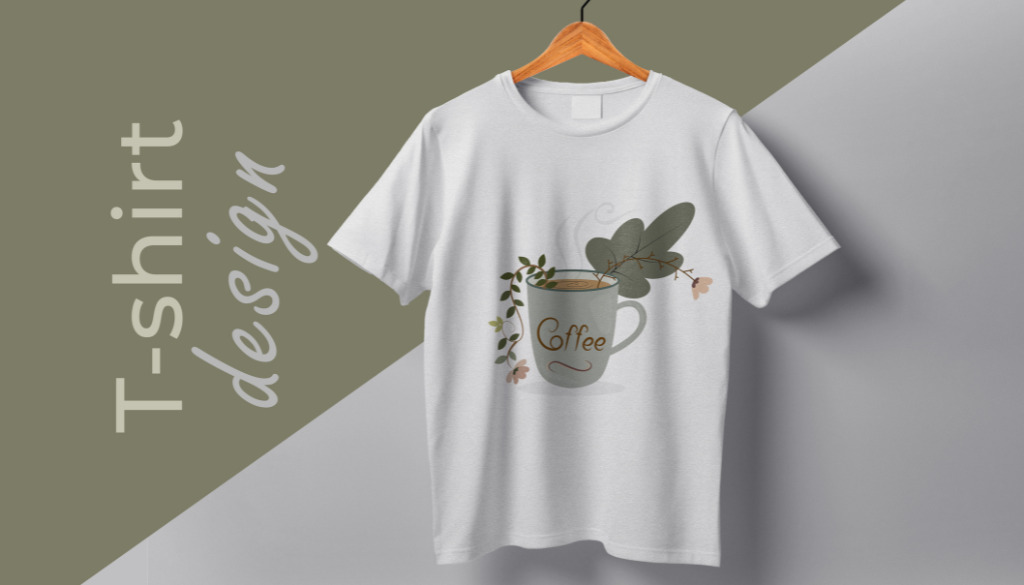
- Description: Positioned at the upper center of the shirt. This is the most versatile placement, suitable for all kinds of designs, from logos and slogans to complex artwork.
- Ideal for: Statement designs, large graphics, bold messages, event shirts, and team apparel.
- Effect: Instantly grabs attention and delivers a clear, powerful impact.
Full Front
- Description: The design spans most or all of the front area of the shirt.
- Ideal for: Large graphics, detailed illustrations, patterns, or designs intended to create maximum visual impact.
- Effect: Bold, striking, and impossible to ignore.
Right Chest
- Description: Similar to left chest placement but on the opposite side. This is a less common choice, often used for contrast.
- Ideal for: Creating symmetry when the left chest has another element (like a pocket), or simply to break traditional design norms.
- Effect: Unique, asymmetric, and visually intriguing.
Left Chest
- Description: A small design positioned over the wearer’s left chest (close to the heart).
- Ideal for: Brand logos, icons, subtle text, and minimalist designs. Commonly seen on polo shirts, corporate uniforms, and fashion brands seeking a clean and professional look.
- Effect: Subtle, refined, and professional. It adds a tasteful touch without overwhelming the overall design.
2. Back Placement
The back of the shirt offers a large “canvas” for creativity.
Center Back
- Description: Positioned at the center of the upper back. This is the most versatile area on the back, suitable for almost any type of design, from logos, slogans, and quotes to complex illustrations.
- Ideal for: Statement designs, large graphics, powerful messages, event shirts, and team apparel.
- Effect: Captures direct attention from behind and leaves a strong, clear impression.
Full Back
- Description: Similar to full front placement, this design covers most or all of the back area.
- Ideal for: Band tour dates, large slogans, event information, or detailed artwork that people may take time to observe.
- Effect: Creates a bold, impactful visual from the back, great for uniforms, tour merch, or brands that want their message seen from a distance.
3. Other Creative Placements
Sleeves
- Description: Small designs placed on the left or right sleeve (or both).
- Ideal for: Secondary logos, icons, numbers, or short text. Adds character and value to the shirt.
- Effect: Adds unique detailing and gives the shirt a more premium, custom look.
Nape (Back Neck)
- Description: A small design placed right below the back collar.
- Ideal for: Brand logos, tiny icons, or short quotes. A great way to include subtle branding.
- Effect: Unexpected, subtle, and professional. Often paired with a larger front design or used when the front is left blank.
Lower Hem / Side Seam
- Description: Design placed near the bottom hem or along the side seam of the shirt.
- Ideal for: Taglines, small logos, or surprising design elements.
- Effect: Modern, minimalist, and fashion-forward, adds a high-end aesthetic to the garment.
Standard Sizes & Placement Guidelines for Each Position
Applying the correct dimensions and spacing ensures your design looks balanced across all shirt sizes. Below is a reference chart:
|
Placement |
Size (inches) |
Notes |
|
Full Front |
15 x 17 |
This is a large print area, ideal for statement designs, complex artwork, or full-front prints. Be sure to align carefully to avoid distortion along the sides. |
|
Chest (Center/Left) |
4.5 x 4.5 |
Perfect for logos, icons, or compact designs on the left chest or center chest. Creates a clean, professional look. |
|
Full Back |
15 x 17 |
Same as the front, this spacious area is great for creative back designs, event info, tour dates, or detailed artwork. |
|
Collar / Nape |
3.8 x 3.8 |
Suitable for brand logos or small icons placed on the back of the neck or inside the collar. Offers subtle, refined branding. |
|
Sleeve |
3.8 x 3.8 |
Standard size for logos, icons, or short text on sleeves. Adds detail and perceived value to the product. |
|
Hem Tag |
3.8 x 3.8 |
Typically used for small brand tags, logos, or minimal design details near the hem. Should remain compact for a clean, modern look. |
Note: The measurements may vary slightly depending on the supplier and the specific shirt model.
Key Notes for Aligning Your T-Shirt Design
Mastering the rules is great, but hands-on experience is what truly sets you apart. Below are essential tips that every POD seller should keep in mind:
- Always Consider Different Shirt Sizes: A design that looks perfect on a size M shirt might appear too small on a 3XL or too large on a size S. Use mockups with various sizes to check proportions. Some POD platforms allow you to adjust placement and size for different-sized groups.
- File Quality Is King: It’s worth repeating: always use transparent PNG files at 300 DPI. This is the bare minimum to ensure sharp prints with no white outlines.
- Avoid the “Danger Zones”: Never place critical design elements too close to the collar, shoulder seams, underarms, side seams, or hem. These areas are not flat and are prone to distortion during printing and wearing. Always leave a safe margin around your design.
- Check Contrast Carefully: A light gray design may look amazing on a black shirt, but disappear on a white one. Always preview your design on all the shirt colors you plan to sell to ensure proper contrast and readability.
- Use Readable Fonts: If your design includes text, make sure the font and size are large enough to read easily. Avoid fonts that are too thin or overly decorative when used in small sizes.
- Understand the Differences Between Shirt Styles: The placement of a design on a crew neck shirt will differ from a V-neck. With V-necks, you may need to lower the design slightly to avoid it sitting too close to the neckline cutout.
- Always Order Samples: This step is non-negotiable. Mockup previews are never 100% accurate compared to real-life products. Ordering samples allows you to check the exact placement, size, color, and print quality before launching a product to customers. It’s a small investment that can save you from costly mistakes later.
Tools to Help Position and Align Your Designs
Technology has made aligning designs easier than ever. Here are some tools you should know:
- Mockup Generators on POD Platforms: Most major POD providers come with built-in mockup generators. When you upload your design, these tools display the safe print area and allow you to drag, drop, resize, and visually align your artwork. This is the most basic yet essential tool.
- Professional Graphic Design Software
- Adobe Photoshop & Illustrator: These two industry giants offer precise tools like rulers, guides, and alignment features that help you prepare perfectly positioned print files before uploading to any POD platform.
- Canva: A beginner-friendly tool, Canva also provides basic alignment features and allows you to create designs with custom pixel dimensions.
- Placeit: This is a massive mockup library. You can upload your design and preview it on thousands of t-shirt templates, models, and lifestyle settings. While it’s not a production alignment tool, it’s great for marketing visuals and testing design ideas.
- Templates and Physical Rulers
- T-shirt Placement Templates: You can find and download templates (in PNG or vector format) that include guidelines for common print placements. Simply overlay the template on your design in Photoshop to double-check positioning.
- T-shirt Ruler Guides: For those printing at home or who want extra accuracy, physical ruler sets made from plastic or acrylic are specially designed for aligning t-shirt prints. These are helpful tools for hands-on checking.
Design placement is not a secondary step; it’s an integral part of the product design process in POD. By taking the time to understand key terms, master standard placement areas, follow size and spacing guidelines, and leverage available tools, you’re laying a solid foundation for your store’s success.
Remember, the ultimate goal is to create a product that not only looks great visually but also feels balanced and professional when worn.
Wishing all FlashShip sellers the best in creating best-selling products and building a sustainable POD brand!
Related Posts: